5 Design Principles for Powerful Marketing

May 16, 2017
Here at Orange Label, it’s our business and our passion to stay current with up-and-coming design trends. Since we are five months into 2017, we thought it would be a good time to share our five favorite design principles of the year, so far.
1. Color Transitions and Gradients
Utilizing color gradients as a brand element has been very popular this year and brands like Instagram and LinkedIn are implementing it in big ways. Here at Orange Label, we love using this technique in our work for Dameron Hospital. The color gradation visually represents the patient’s recovery journey from start to finish. From landing pages to print ads, the application of gradients stays consistent to ensure brand recognition.
2. Modern Retro
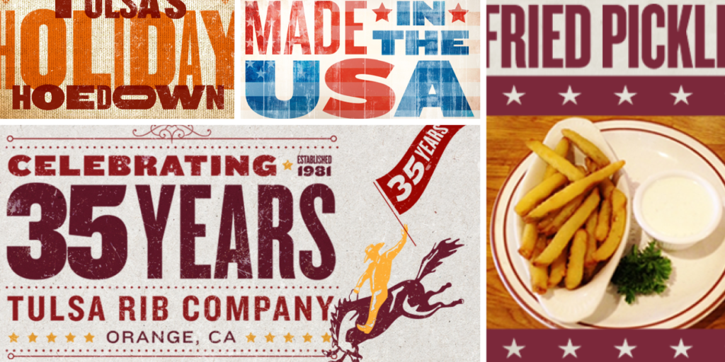
Design trends, just like fashion, tend to by cyclical. Modern Retro is currently on the rise with restaurants like Snooze A.M. Eatery and breweries like Bottle Logic crafting their brands around these classic looks. At Orange Label, we bring this concept to life with Tulsa Rib Company who have been serving classic down-home BBQ in Orange County for 40 years. We love mixing it up with a Modern Retro appeal that brings back the nostalgia of down-home cooking and conveys the authenticity of their brand.
3. Minimalist Logos
Minimalism as a design principle has been around for centuries, evolving and transitioning into new mediums and technologies. Today, brands like Nike and Apple have risen to mega iconic stardom by keeping their logos and overall brand experience simple. Orange Label client Moulton Niguel Water District’s logo has been simplified into basic three shapes that resizes perfectly for responsive web design.
4. Use of Bold Color
In this digital age where brands are constantly fighting for relevancy and exposure, the design world is exploding with bold color-blocking. Gone are the days of muted, neutral web color. Today we play at full opacity. Companies are finding ways to incorporate this trend into their branded look and feel. For example, we see Google color-blocking its iconic yellow-red-blue-green color scheme on mobile apps. Google successfully pulls this off with a wide range of vibrant eye catching colors, whereas iconic brands like Coca Cola and Target use a single color. Either way, it’s about execution and brand consistency. The breathtaking colors showcased in Hawaii Forest and Trail and Kohala Zipline’s branded content draw grab attention and draw the viewer in. Demonstrating bold color-blocking and vivid colors, the imagery featured in these ads ignites our human desire to explore and discover.
5. Illustrations
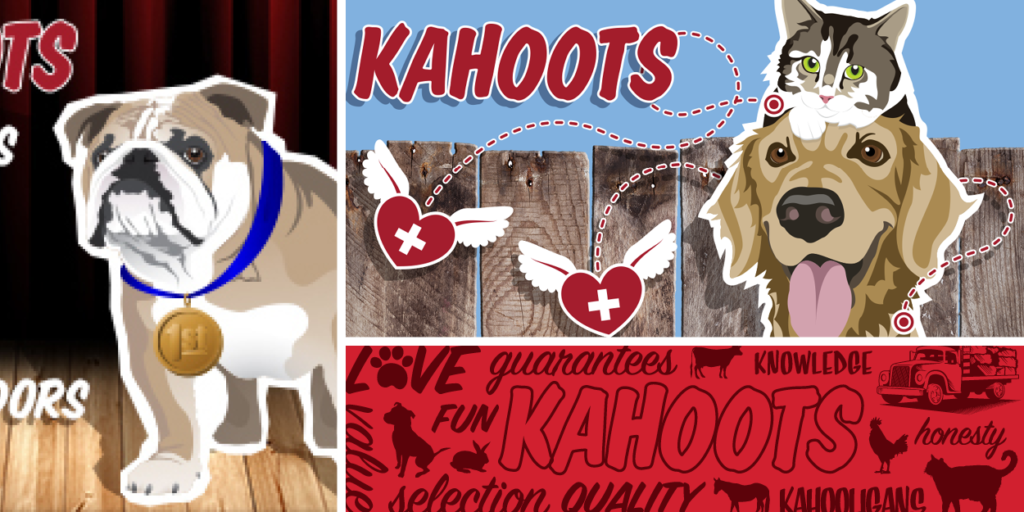
Brands are beginning to gravitate toward the “illustrated look” and companies like Dropbox and MailChimp have already jumped on this trend. Whether it’s hand-drawn or digital, people are drawn (pun intended) to the fun, expressive qualities of illustration. Looking at this example from client Kahoots Feed and Pet Store, illustration expresses the brand’s Core Values of “Fun” and “Friendly” while creating a memorable brand look.
The world of design is constantly changing, offering new and innovative assets for marketing strategy. Luckily, we love talking about design, so keep an eye out for more to come.


